SmartMappingSliderBase
esri/widgets/smartMapping/SmartMappingSliderBaseThe base class for all Smart Mapping slider widgets.
Property Overview
| Name | Type | Summary | Class | |
|---|---|---|---|---|
| String|HTMLElement | The ID or node representing the DOM element containing the widget. more details | more details | Widget | |
| String | The name of the class. more details | more details | Accessor | |
| Boolean | When | more details | Widget | |
| HistogramConfig | The Histogram associated with the data represented on the slider. more details | more details | SmartMappingSliderBase | |
| String | The unique ID assigned to the widget when the widget is created. more details | more details | Widget | |
| LabelFormatter | A function used to format user inputs. more details | more details | SmartMappingSliderBase | |
| InputParser | Function used to parse slider inputs formatted by the inputFormatFunction. more details | more details | SmartMappingSliderBase | |
| String | The widget's label. more details | more details | Widget | |
| LabelFormatter | A modified version of Slider.labelFormatFunction, which is a custom function used to format labels on the thumbs, min, max, and average values. more details | more details | SmartMappingSliderBase | |
| Number | The maximum value or upper bound of the slider. more details | more details | SmartMappingSliderBase | |
| Number | The minimum value or lower bound of the slider. more details | more details | SmartMappingSliderBase | |
| Number | Defines how slider thumb values should be rounded. more details | more details | SmartMappingSliderBase | |
| String | The state of the view model. more details | more details | SmartMappingSliderBase | |
| Object | Zooms the slider track to the bounds provided in this property. more details | more details | SmartMappingSliderBase |
Property Details
The ID or node representing the DOM element containing the widget. This property can only be set once. The following examples are all valid use cases when working with widgets.
Examples:// Create the HTML div element programmatically at runtime and set to the widget's container const basemapGallery = new BasemapGallery({ view: view, container: document.createElement("div") }); // Add the widget to the top-right corner of the view view.ui.add(basemapGallery, { position: "top-right" });// Specify an already-defined HTML div element in the widget's container const basemapGallery = new BasemapGallery({ view: view, container: basemapGalleryDiv }); // Add the widget to the top-right corner of the view view.ui.add(basemapGallery, { position: "top-right" }); // HTML markup <body> <div id="viewDiv"></div> <div id="basemapGalleryDiv"></div> </body>// Specify the widget while adding to the view's UI const basemapGallery = new BasemapGallery({ view: view }); // Add the widget to the top-right corner of the view view.ui.add(basemapGallery, { position: "top-right" });
The name of the class. The declared class name is formatted as
esri.folder.className.
When
true, this property indicates whether the widget has been destroyed.
- histogramConfig HistogramConfig
The Histogram associated with the data represented on the slider. The bins are typically generated using the histogram statistics function.
Example:histogram({ layer: featureLayer, field: "fieldName", numBins: 30 }).then(function(histogramResult){ // set the histogram to the slider slider.histogramConfig = { bins: histogramResult.bins }; });
The unique ID assigned to the widget when the widget is created. If not set by the developer, it will default to the container ID, or if that is not present then it will be automatically generated.
- inputFormatFunction LabelFormatterSince: ArcGIS API for JavaScript 4.14
A function used to format user inputs. As opposed to labelFormatFunction, which formats thumb labels, the
inputFormatFunctionformats thumb values in the input element when the user begins to edit them.The image below demonstrates how slider input values resemble corresponding slider values by default and won't match the formatting set in
labelFormatFunction.
If you want to format slider input values so they match thumb labels, you can pass the same function set in
labelFormatFunctiontoinputFormatFunctionfor consistent formatting.
However, if an
inputFormatFunctionis specified, you must also write a corresponding inputParseFunction to parse user inputs to understandable slider values. In most cases, if you specify aninputFormatFunction, you should set the labelFormatFunction to the same value for consistency between labels and inputs.This property overrides the default input formatter, which formats by calling
toString()on the input value.- See also:
Example:// Formats the slider input to abbreviated numbers with units // e.g. a thumb at position 1500 will render with an input label of 1.5k slider.inputFormatFunction = function(value, type){ if(value >= 1000000){ return (value / 1000000).toPrecision(3) + "m" } if(value >= 100000){ return (value / 1000).toPrecision(3) + "k" } if(value >= 1000){ return (value / 1000).toPrecision(2) + "k" } return value.toFixed(0); }
- inputParseFunction InputParserSince: ArcGIS API for JavaScript 4.14
Function used to parse slider inputs formatted by the inputFormatFunction. This property must be set if an
inputFormatFunctionis set. Otherwise the slider values will likely not update to their expected positions.Overrides the default input parses, which is a parsed floating point number.
- See also:
Example:// Parses the slider input (a string value) to a number value understandable to the slider // This assumes the slider was already configured with an inputFormatFunction // For example, if the input is 1.5k this function will parse // it to a value of 1500 slider.inputParseFunction = function(value, type, index){ var charLength = value.length; var valuePrefix = parseFloat(value.substring(0,charLength-1)); var finalChar = value.substring(charLength-1); if(parseFloat(finalChar) >= 0){ return parseFloat(value); } if(finalChar === "k"){ return valuePrefix * 1000; } if(finalChar === "m"){ return valuePrefix * 1000000; } return value; }
The widget's label.
This property is useful whenever the widget is controlled by another one (e.g. Expand)
- labelFormatFunction LabelFormatter
A modified version of Slider.labelFormatFunction, which is a custom function used to format labels on the thumbs, min, max, and average values. Overrides the default label formatter. This function also supports date formatting.
Example:// For thumb values, rounds each label to whole numbers slider.labelFormatFunction = function(value, type) { return (type === "value-change") ? value.toFixed(0): value; }
- max Number
The maximum value or upper bound of the slider. If the largest slider value in the constructor is greater than the
maxset in this property, then themaxwill update to match the largest slider value.Example:slider.max = 150;
- min Number
The minimum value or lower bound of the slider. If the smallest slider value in the constructor is greater than the
minset in this property, then theminwill update to match the smallest slider value.Example:slider.min = -150;
- precision NumberSince: ArcGIS API for JavaScript 4.14
Defines how slider thumb values should be rounded. This number indicates the number of decimal places slider thumb values should round to when they have been moved.
This value also indicates the precision of thumb labels when the data range is less than
10(i.e.(max - min) < 10).When the data range is larger than
10, labels display with a precision of no more than two decimal places, though actual slider thumb values will maintain the precision specified in this property.For example, given the default precision of
4, and the following slider configuration, The labels of the thumbs will display two decimal places, but the precision of the actual thumb values will not be lost even when the user slides or moves the thumb.const slider = new Slider({ min: 20, max: 100, // data range of 80 values: [50.4331], // thumb label will display 50.43 // thumb value will maintain precision, so // value will remain at 50.4331 container: "sliderDiv" });If the user manually enters a value that has a higher precision than what's indicated by this property, the precision of that thumb value will be maintained until the thumb is moved by the user. At that point, the value will be rounded according to the indicated precision.
If thumb labels aren't visible, they must be enabled with labelInputsEnabled.
Keep in mind this property rounds thumb values and shouldn't be used exclusively for formatting purposes. To format thumb
labels, use the labelFormatFunction property.- Default Value:4
Example:slider.precision = 7;
- state Stringreadonly
The state of the view model.
Possible Values:"ready"|"disabled"
- zoomOptions Object
Zooms the slider track to the bounds provided in this property. When min and/or max zoom values are provided, the absolute min and max slider values are preserved and rendered at their typical positions on the slider. However, the slider track itself is zoomed so that thumbs cannot be moved above or below the provided min and max zoomed values.
When a slider is in a zoomed state, the zoomed ends of the track will appear jagged. In the image below, notice how the top thumb cannot be moved past the zoom max of
31even though the slider max is200.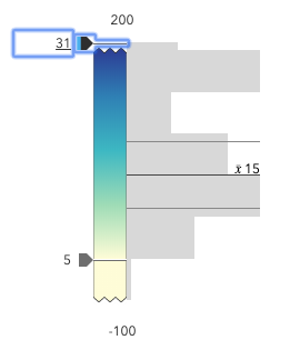
To exit a zoomed state, the user can click the jagged line or the developer can set the
zoomOptionstonull. It is up to the developer to provide a UI option for end users to enable zooming on the slider.Setting the
zoomOptionsis useful when the slider is tied to heavily skewed datasets where the histogram renders only one or two bars because of outliers.
You can remove the influence of outliers by zooming the slider and regenerating a histogram based on the zoomed min and max. This will provide a better view of the data and make the slider more useful to the end user.
- Properties:
- optionalmin Number
The lower bound of the zoom.
optionalmax NumberThe upper bound of the zoom.
Examples:// zooms the slider to so thumbs can only be moved // to positions between the values of 10 and 25 while // maintaining the slider's absolute minimum and // maximum values slider.zoomOptions = { min: 10, max: 25 };// disables zooming on the slider slider.zoomOptions = null;// zooms the slider to so thumbs can only be moved // to positions above the value of 10, while maintaining // the slider's absolute minimum value slider.zoomOptions = { min: 10 };// zooms the slider to so thumbs can only be moved // to positions below the value of 25, while maintaining // the slider's absolute maximum value slider.zoomOptions = { max: 25 };// zooms the slider to the handle positions // with some padding document.getElementById("zoomInButton").onclick = function() { const lowerThumb = slider.values[0]; const upperThumb = slider.values[1]; const range = upperThumb - lowerThumb; const padding = range * 0.3; const zoomMin = (lowerThumb - padding) > slider.min ? (lowerThumb - padding) : slider.min; const zoomMax = (upperThumb + padding) < slider.max ? (upperThumb + padding) : slider.max; slider.set({ zoomOptions: { min: zoomMin, max: zoomMax } }); };
Method Overview
| Name | Return Type | Summary | Class | |
|---|---|---|---|---|
| String | A utility method used for building the value for a widget's | more details | Widget | |
Destroys the widget instance. more details | more details | Widget | ||
| Boolean | Emits an event on the instance. more details | more details | Widget | |
| Boolean | Indicates whether there is an event listener on the instance that matches the provided event name. more details | more details | Widget | |
| Object | Registers an event handler on the instance. more details | more details | Widget | |
Widget teardown helper. more details | more details | Widget | ||
This method is primarily used by developers when implementing custom widgets. more details | more details | Widget | ||
| Object | This method is primarily used by developers when implementing custom widgets. more details | more details | Widget | |
Renders widget to the DOM immediately. more details | more details | Widget | ||
This method is primarily used by developers when implementing custom widgets. more details | more details | Widget |
Method Details
A utility method used for building the value for a widget's
classproperty. This aids in simplifying CSS class setup.Parameter:repeatable The class names.
Returns:Type Description String The computed class name. Example:// .tsx syntax showing how to set CSS classes while rendering the widget render() { const dynamicIconClasses = { [CSS.myIcon]: this.showIcon, [CSS.greyIcon]: !this.showIcon }; return ( <div class={classes(CSS.root, CSS.mixin, dynamicIconClasses)} /> ); }
- destroy()inherited
Destroys the widget instance.
Emits an event on the instance. This method should only be used when creating subclasses of this class.
Parameters:type StringThe name of the event.
event ObjectoptionalThe event payload.
Returns:Type Description Boolean trueif a listener was notified
Indicates whether there is an event listener on the instance that matches the provided event name.
Parameter:type StringThe name of the event.
Returns:Type Description Boolean Returns true if the class supports the input event.
Registers an event handler on the instance. Call this method to hook an event with a listener.
Parameters:A event type, or an array of event types, to listen for.
listener FunctionThe function to call when the event is fired.
Returns:Type Description Object Returns an event handler with a remove()method that can be called to stop listening for the event(s).Property Type Description remove Function When called, removes the listener from the event. Example:view.on("click", function(event){ // event is the event handle returned after the event fires. console.log(event.mapPoint); });
- own(handles)inherited
Widget teardown helper. Any handles added to it will be automatically removed when the widget is destroyed.
Parameter:handles WatchHandle|WatchHandle[]Handles marked for removal once the widget is destroyed.
- postInitialize()inherited
This method is primarily used by developers when implementing custom widgets. Executes after widget is ready for rendering.
This method is primarily used by developers when implementing custom widgets. It must be implemented by subclasses for rendering.
Returns:Type Description Object The rendered virtual node.
- renderNow()inherited
Renders widget to the DOM immediately.
- scheduleRender()inherited
This method is primarily used by developers when implementing custom widgets. Schedules widget rendering. This method is useful for changes affecting the UI.
Type Definitions
- HistogramConfig
Configuration options for defining the slider's Histogram.
- Properties:
- optionalaverage Number
Indicates the average value of the dataset. When set, a solid line on the histogram will render at the location of the average value along with a label defaulting to the value set here.
optionalbarCreatedFunction BarCreatedFunctionFunction for styling bars representing histogram bins. This can be used to style bins or add custom interaction to them. For example, you can use this function to color bins that match the colors on the slider's track.
optional The bins of the histogram. This is an array of objects indicating the range and count of data in each bin. This value is typically retrieved from the histogram function.
optional When set, renders lines on the histogram that indicate important or meaningful values to the end user.
- Specification:
- optionalvalue Number
The value on the data axis of the histogram where a line will be rendered.
optional The label associated with the line.
optionaldataLineCreatedFunction DataLineCreatedFunctionFunction that fires each time a data line is created. You can use this to style individual dataLines on the data axis.
optionalstandardDeviation NumberIndicates the standard deviation of the dataset. When set, data lines are on the histogram at the locations of the standard deviations above and below the
average.optionalstandardDeviationCount NumberIndicates the standard deviation of the dataset. When set, data lines are on the histogram at the locations of the standard deviations above and below the
average.
- LabelFormatter(value, type, index){String}
Function used to format thumb labels. This function should be set to the labelFormatFunction property. This function fires every time a label is created or updated on the slider.
Parameters:value NumberThe value of the thumb.
type StringoptionalThe label type. Valid types include
average,min,max, andvalue.index NumberoptionalThe index of the thumb (or value).
Returns:Type Description String The formatted value for the label.
Event Overview
| Name | Type | Summary | Class | |
|---|---|---|---|---|
{oldValue: Number,type: "max-change",value: Number} | Fires when a user changes the max of the slider. more details | more details | SmartMappingSliderBase | |
{oldValue: Number,type: "min-change",value: Number} | Fires when a user changes the min of the slider. more details | more details | SmartMappingSliderBase | |
{index: Number,oldValue: Number,type: "thumb-change",value: Number} | Fires when a user changes the value of a thumb via arrow keys and keyboard editing of the label on the widget. more details | more details | SmartMappingSliderBase | |
{index: Number,state: "start","drag",type: "thumb-drag",value: Number} | Fires when a user drags a thumb on the widget. more details | more details | SmartMappingSliderBase |
Event Details
- max-change
Fires when a user changes the max of the slider.
- Properties:
- oldValue Number
The former max (or bound) of the slider.
type StringThe type of the event.
The value is always "max-change".
value NumberThe value of the max (or bound) of the slider when the event is emitted.
Example:slider.on("max-change", function() { const renderer = layer.renderer.clone(); const visualVariable = renderer.visualVariables[0].clone(); colorVariable.stops = slider.stops; renderer.visualVariables = [ visualVariable ]; layer.renderer = renderer; });
- min-change
Fires when a user changes the min of the slider.
- Properties:
- oldValue Number
The former min value (or bound) of the slider.
type StringThe type of the event.
The value is always "min-change".
value NumberThe value of the min value (or bound) of the slider when the event is emitted.
Example:slider.on("min-change", function() { const renderer = layer.renderer.clone(); const visualVariable = renderer.visualVariables[0].clone(); colorVariable.stops = slider.stops; renderer.visualVariables = [ visualVariable ]; layer.renderer = renderer; });
- thumb-change
Fires when a user changes the value of a thumb via arrow keys and keyboard editing of the label on the widget.
- Properties:
- index Number
The 0-based index of the thumb emitting the event.
oldValue NumberThe former value of the thumb before the change was made.
type StringThe type of the event.
The value is always "thumb-change".
value NumberThe value of the thumb when the event is emitted.
Example:slider.on("thumb-change", function() { const renderer = layer.renderer.clone(); const visualVariable = renderer.visualVariables[0].clone(); colorVariable.stops = slider.stops; renderer.visualVariables = [ visualVariable ]; layer.renderer = renderer; });
- thumb-drag
Fires when a user drags a thumb on the widget.
- Properties:
- index Number
The 0-based index of the thumb emitting the event.
state StringThe state of the drag.
type StringThe type of the event.
The value is always "thumb-drag".
value NumberThe value of the thumb when the event is emitted.
Example:slider.on("thumb-drag", function() { const renderer = layer.renderer.clone(); const visualVariable = renderer.visualVariables[0].clone(); colorVariable.stops = slider.stops; renderer.visualVariables = [ visualVariable ]; layer.renderer = renderer; });