Editor
require(["esri/widgets/Editor"], function(Editor) { /* code goes here */ });esri/widgets/EditorThis widget provides an out-of-the-box editing experience to help streamline the editing experience within a web application. The widget has two different Workflows, create and update. These workflows allow you to either add features or edit and/or delete existing features within an editable feature layer. The widget automatically recognizes if there are editable feature layers within the map. If it recognizes that they are editable, the layers can be used by the widget. In addition, it is also possible to configure how the Editor behaves by setting its layerInfos property. This property takes an array of configuration objects which allow you to configure the editing experience for these layers.
Known Limitations
The Editor widget is not yet at full parity with the functionality provided in the 3.x Editor widget. For example, there is currently no support for editing attachments or related feature attributes. There is also currently no support for editing feature layers derived from feature collections and is currently only supported when working with MapViews.
- See also:
var editor = new Editor({
  view: view
});

view.ui.add(editor, "top-right");
Constructors
- new Editor(properties)
- Parameter:properties Objectoptional
See the properties for a list of all the properties that may be passed into the constructor.
Example:// Typical usage for Editor widget. This will recognize all editable layers in the map. const editor = new Editor({ view: viewDiv });
Property Overview
| Name | Type | Summary | Class | |
|---|---|---|---|---|
| Workflow | A property indicating the current active workflow. more details | more details | Editor | |
| String[] | An array of string values which specifies what end users are allowed to edit. more details | more details | Editor | |
| String|HTMLElement | The ID or node representing the DOM element containing the widget. more details | more details | Widget | |
| String | The name of the class. more details | more details | Accessor | |
| Boolean | When | more details | Widget | |
| String | The widget's default CSS icon class. more details | more details | Editor | |
| String | The unique ID assigned to the widget when the widget is created. more details | more details | Widget | |
| String | The widget's default label. more details | more details | Editor | |
| LayerInfo[] | An array of editing configurations for individual layers. more details | more details | Editor | |
| SupportingWidgetDefaults | This property allows customization of supporting Editor widgets and their default behavior. more details | more details | Editor | |
| MapView | A reference to the MapView. more details | more details | Editor | |
| EditorViewModel | The view model for this widget. more details | more details | Editor |
Property Details
- activeWorkflow Workflowreadonly
A property indicating the current active workflow.
An array of string values which specifies what end users are allowed to edit. For example, a feature layer with full editing privileges may be available. But you may only want the end user to have the ability to update existing features. Set the
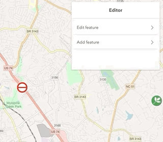
allowedWorkflowsto onlyupdate.Possible Value Description Example create Indicated in the widget via the Add featureoption. This allows the end user to create new features in the feature service.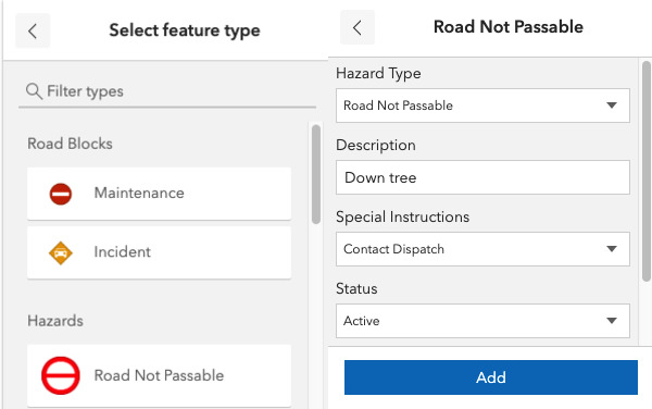
update Indicated in the widget via the Edit featureoption. This allows the end user to update and/or delete features in the feature service.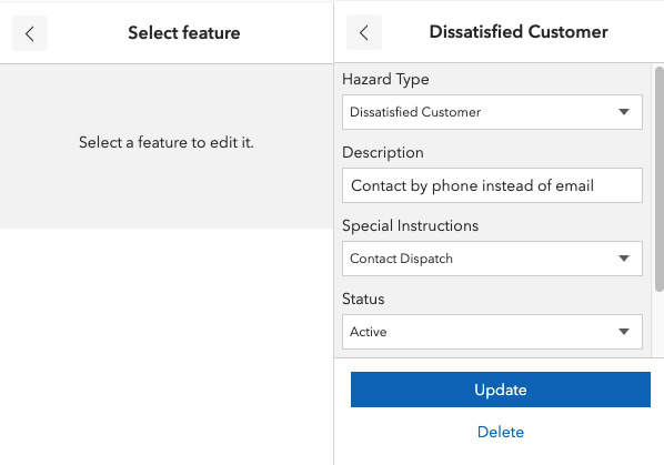
These workflows are only enabled if the feature service allows these operations. For example, if a feature service is only enabled to allow updates,
Add featuresis not enabled.Example:const editor = new Editor({ view: view, allowedWorkflows: ["update"] // allows only updates and no adds });
The ID or node representing the DOM element containing the widget. This property can only be set once. The following examples are all valid use cases when working with widgets.
Examples:// Create the HTML div element programmatically at runtime and set to the widget's container const basemapGallery = new BasemapGallery({ view: view, container: document.createElement("div") }); // Add the widget to the top-right corner of the view view.ui.add(basemapGallery, { position: "top-right" });// Specify an already-defined HTML div element in the widget's container const basemapGallery = new BasemapGallery({ view: view, container: basemapGalleryDiv }); // Add the widget to the top-right corner of the view view.ui.add(basemapGallery, { position: "top-right" }); // HTML markup <body> <div id="viewDiv"></div> <div id="basemapGalleryDiv"></div> </body>// Specify the widget while adding to the view's UI const basemapGallery = new BasemapGallery({ view: view }); // Add the widget to the top-right corner of the view view.ui.add(basemapGallery, { position: "top-right" });
The name of the class. The declared class name is formatted as
esri.folder.className.
When
true, this property indicates whether the widget has been destroyed.
- iconClass Stringreadonly
The widget's default CSS icon class.
The unique ID assigned to the widget when the widget is created. If not set by the developer, it will default to the container ID, or if that is not present then it will be automatically generated.
- label String
The widget's default label.
An array of editing configurations for individual layers.
If you have an editable feature layer but do not want the end user to do any type of editing, you can limit this by setting the
enabledproperty tofalse.Example:const editor = new Editor({ layerInfos: [{ layer: featureLayer, // pass in the feature layer fieldConfig: [ // Specify which fields to configure { name: "fulladdr", label: "Full Address" }, { name: "neighborhood", label: "Neighborhood" }], enabled: true, // default is true, set to false to disable editing functionality addEnabled: true, // default is true, set to false to disable the ability to add a new feature updateEnabled: false // default is true, set to false to disable the ability to edit an existing feature deleteEnabled: false // default is true, set to false to disable the ability to delete features }] });
- supportingWidgetDefaults SupportingWidgetDefaults
This property allows customization of supporting Editor widgets and their default behavior. These widgets include FeatureForm, FeatureTemplates, and Sketch.
This property is useful for basic overrides of the default widgets. There may be some limitations to what the Editor can do with these overridden properties. For example, the Editor will always disable the
multipleSelectionEnabledproperty in Sketch.defaultUpdateOptions no matter what is set within this property.
- view MapView
A reference to the MapView. This view provides the editable layers for the Editor widget.
- viewModel EditorViewModelautocast
The view model for this widget. This is a class that contains all the logic (properties and methods) that controls this widget's behavior. See the EditorViewModel class to access all properties and methods on the widget.
Method Overview
| Name | Return Type | Summary | Class | |
|---|---|---|---|---|
Cancels any active workflow. more details | more details | Editor | ||
| String | A utility method used for building the value for a widget's | more details | Widget | |
This is applicable if there is an active update workflow. more details | more details | Editor | ||
Destroys the widget instance. more details | more details | Widget | ||
| Boolean | Emits an event on the instance. more details | more details | Widget | |
| Boolean | Indicates whether there is an event listener on the instance that matches the provided event name. more details | more details | Widget | |
| Object | Registers an event handler on the instance. more details | more details | Widget | |
Widget teardown helper. more details | more details | Widget | ||
This method is primarily used by developers when implementing custom widgets. more details | more details | Widget | ||
| Object | This method is primarily used by developers when implementing custom widgets. more details | more details | Widget | |
Renders widget to the DOM immediately. more details | more details | Widget | ||
This method is primarily used by developers when implementing custom widgets. more details | more details | Widget | ||
Initiates the | more details | Editor | ||
This method starts the Editor workflow where it waits for the feature to be selected. more details | more details | Editor | ||
Initiates the | more details | Editor | ||
Starts the | more details | Editor | ||
Starts the | more details | Editor | ||
This method starts the Editor workflow where it waits for multiple features to be selected. more details | more details | Editor |
Method Details
- cancelWorkflow()
Cancels any active workflow.
A utility method used for building the value for a widget's
classproperty. This aids in simplifying CSS class setup.Parameter:repeatable The class names.
Returns:Type Description String The computed class name. Example:// .tsx syntax showing how to set CSS classes while rendering the widget render() { const dynamicIconClasses = { [CSS.myIcon]: this.showIcon, [CSS.greyIcon]: !this.showIcon }; return ( <div class={classes(CSS.root, CSS.mixin, dynamicIconClasses)} /> ); }
- deleteFeatureFromWorkflow()
This is applicable if there is an active update workflow. If so, this method deletes the workflow feature.
- destroy()inherited
Destroys the widget instance.
Emits an event on the instance. This method should only be used when creating subclasses of this class.
Parameters:type StringThe name of the event.
event ObjectoptionalThe event payload.
Returns:Type Description Boolean trueif a listener was notified
Indicates whether there is an event listener on the instance that matches the provided event name.
Parameter:type StringThe name of the event.
Returns:Type Description Boolean Returns true if the class supports the input event.
Registers an event handler on the instance. Call this method to hook an event with a listener.
Parameters:A event type, or an array of event types, to listen for.
listener FunctionThe function to call when the event is fired.
Returns:Type Description Object Returns an event handler with a remove()method that can be called to stop listening for the event(s).Property Type Description remove Function When called, removes the listener from the event. Example:view.on("click", function(event){ // event is the event handle returned after the event fires. console.log(event.mapPoint); });
- own(handles)inherited
Widget teardown helper. Any handles added to it will be automatically removed when the widget is destroyed.
Parameter:handles WatchHandle|WatchHandle[]Handles marked for removal once the widget is destroyed.
- postInitialize()inherited
This method is primarily used by developers when implementing custom widgets. Executes after widget is ready for rendering.
This method is primarily used by developers when implementing custom widgets. It must be implemented by subclasses for rendering.
Returns:Type Description Object The rendered virtual node.
- renderNow()inherited
Renders widget to the DOM immediately.
- scheduleRender()inherited
This method is primarily used by developers when implementing custom widgets. Schedules widget rendering. This method is useful for changes affecting the UI.
- startCreateWorkflowAtFeatureCreation(creationInfo)
Initiates the
createworkflow by displaying the panel where feature creation begins. This method takes a CreationInfo object containing the layer(s) and template(s) to use.Parameter:creationInfo CreationInfoAn object containing information needed to create a new feature using the Editor widget. This object provides the feature template and layer for creating a new feature.
- startCreateWorkflowAtFeatureEdit(feature)
This method starts the Editor workflow where it waits for the feature to be selected.
Parameter:feature GraphicThe feature to be edited.
- startCreateWorkflowAtFeatureTypeSelection()
Initiates the
createworkflow by displaying the FeatureTemplates panel.
- startUpdateWorkflowAtFeatureEdit(feature)
Starts the
updateworkflow at the feature geometry and attribute editing panel.Parameter:feature GraphicThe feature to be updated.
- startUpdateWorkflowAtFeatureSelection()
Starts the
updateworkflow using the current selected feature.
- startUpdateWorkflowAtMultipleFeatureSelection(_candidates)
This method starts the Editor workflow where it waits for multiple features to be selected.
Parameter:An array of features to be updated. This is only relevant when there are multiple candidates to update.
Type Definitions
- CreationInfo
This object provides the feature template and layer for creating a new feature.
- Properties:
- layer FeatureLayer
The associated feature layer where the new feature is created.
template FeatureTemplateThe associated feature template used to create the new feature.
- LayerInfo
Editor configurations used for an array of fields.
- Properties:
- layer FeatureLayer
The associated feature layer containing the editable fields.
optionalfieldConfig FieldConfig[]The configuration options for displaying an array of fields within the widget. Take note that all fields except for
editor,globalID,objectID, and system maintained area and length fields will be included. Otherwise, it is up to the developer to set the right field(s) to override and display.If this is set, in addition to overrides in the supportingWidgetDefaults, the overrides specified in the supportingWidgetDefaults property take precedence.
optionalenabled BooleanDefault Value:trueIndicates whether to enable editing on the layer. Defaults to
trueif service supports it.optionaladdEnabled BooleanIndicates whether to enable
Add featurefunctionality. Defaults totrueif service supports it.optionalupdateEnabled BooleanIndicates whether to enable
Update featurefunctionality. Defaults totrueif service supports it.optionaldeleteEnabled BooleanIndicates whether to enable the ability to delete features. Defaults to
trueif service supports it.
- SupportingWidgetDefaults
Set this to customize any supporting Editor widgets default behavior. These widgets include FeatureForm, FeatureTemplates, and Sketch.
- Properties:
- optionalfeatureForm Object
An object containing properties specific for customizing the FeatureForm widget.
- Specification:
- optionalfieldConfig FieldConfig[]
An array of FieldConfig objects to use within the FeatureForm.
Any field configurations set within the layerInfos property will be overridden if it is set here in the supportingWidgetDefaults property.
optionalgroupDisplay StringString indicating the groupDisplay and how they will be displayed to the end user.
optionalfeatureTemplates ObjectAn object containing properties specific for customizing the FeatureTemplates widget.
- Specification:
- optionalgroupBy String|GroupByFunction
Aids in managing various template items and how they display within the widget. Please refer to groupBy API reference for additional information.
optionalfilterEnabled BooleanIndicates whether the templates filter displays.
optionalsketch ObjectAn object containing properties specific for customizng the Sketch widget.
- Specification:
- optionaldefaultUpdateOptions Object
An object containing the
defaultUpdateOptionsfor the Sketch widget.optionalmarkerSymbol SimpleMarkerSymbolThe marker symbol used to symbolize any point feature updates.
optionalpolygonSymbol SimpleFillSymbolThe polygon symbol used to symbolize any polygon feature updates.
optionalpolylineSymbol SimpleLineSymbolThe line symbol used to symbolize any line feature updates.