Swipe
require(["esri/widgets/Swipe"], function(Swipe) { /* code goes here */ });esri/widgets/SwipeThe Swipe widget provides a tool to show a portion of a layer or layers on top of a map. Layers can be swiped vertically or horizontally to easily compare two layers or see what is underneath a layer.
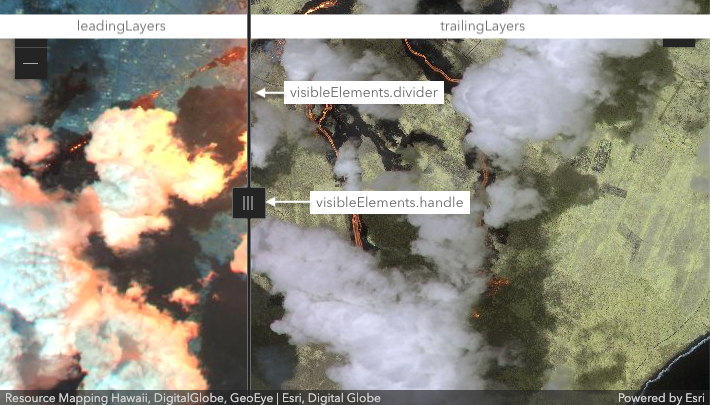
To use the Swipe widget, set the leadingLayers and trailingLayers properties to determine what will be compared on either side of the widget. If one of these properties is not set, then the Swipe widget will overlay the existing map. The visibleElements separate the leading and trailing layers, as shown in the image below.
Known Limitations
- This widget is not currently supported with a SceneView.
- There is no current support for GroupLayer in the
leadingLayersortrailingLayers.
- See also:
var swipe = new Swipe({
  view: view,
  leadingLayers: [layer1, layer2],
  trailingLayers: [layer3],
  direction: "vertical", // swipe widget will move from top to bottom of view
  position: 50 // position set to middle of the view (50%)
});
view.ui.add(swipe);
Constructors
- new Swipe(properties)
- Parameter:properties Objectoptional
See the properties for a list of all the properties that may be passed into the constructor.
Property Overview
| Name | Type | Summary | Class | |
|---|---|---|---|---|
| String|HTMLElement | The ID or node representing the DOM element containing the widget. more details | more details | Widget | |
| String | The name of the class. more details | more details | Accessor | |
| Boolean | When | more details | Widget | |
| String | The direction the Swipe widget moves across the view. more details | more details | Swipe | |
| Boolean | When | more details | Swipe | |
| String | The text that shows in a tooltip when hovering over the handle of the Swipe widget. more details | more details | Swipe | |
| String | The widget's default CSS icon class. more details | more details | Swipe | |
| String | The unique ID assigned to the widget when the widget is created. more details | more details | Widget | |
| String | The widget's default label. more details | more details | Swipe | |
| Collection<Layer> | A collection of Layers that will show on the left or top side of the Swipe widget. more details | more details | Swipe | |
| Number | The position of the Swipe widget. more details | more details | Swipe | |
| Collection<Layer> | A collection of Layers that will show on the right or bottom side of the Swipe widget. more details | more details | Swipe | |
| MapView | A reference to the MapView. more details | more details | Swipe | |
| SwipeViewModel | The view model for this widget. more details | more details | Swipe | |
| Object | The visible elements that are displayed within the widget. more details | more details | Swipe |
Property Details
The ID or node representing the DOM element containing the widget. This property can only be set once. The following examples are all valid use cases when working with widgets.
Examples:// Create the HTML div element programmatically at runtime and set to the widget's container const basemapGallery = new BasemapGallery({ view: view, container: document.createElement("div") }); // Add the widget to the top-right corner of the view view.ui.add(basemapGallery, { position: "top-right" });// Specify an already-defined HTML div element in the widget's container const basemapGallery = new BasemapGallery({ view: view, container: basemapGalleryDiv }); // Add the widget to the top-right corner of the view view.ui.add(basemapGallery, { position: "top-right" }); // HTML markup <body> <div id="viewDiv"></div> <div id="basemapGalleryDiv"></div> </body>// Specify the widget while adding to the view's UI const basemapGallery = new BasemapGallery({ view: view }); // Add the widget to the top-right corner of the view view.ui.add(basemapGallery, { position: "top-right" });
The name of the class. The declared class name is formatted as
esri.folder.className.
When
true, this property indicates whether the widget has been destroyed.
- direction String
The direction the Swipe widget moves across the view. If
"horizontal", the widget will move left and right and if"vertical", the widget will move up and down.horizontal vertical 
Possible Values:"horizontal"|"vertical"
- Default Value:"horizontal"
- disabled Boolean
When
true, sets the widget to a disabled state so the user cannot interact with it.- Default Value:false
- dragLabel String
The text that shows in a tooltip when hovering over the handle of the Swipe widget.
- iconClass String
The widget's default CSS icon class.
The unique ID assigned to the widget when the widget is created. If not set by the developer, it will default to the container ID, or if that is not present then it will be automatically generated.
- label String
The widget's default label.
- leadingLayers Collection<Layer>autocast
A collection of Layers that will show on the left or top side of the Swipe widget. See the image in the class description at the top of the page. Currently, all layers are supported except GroupLayers.
- See also:
- position Number
The position of the Swipe widget. This determines what percentage of the view will be taken up by the leadingLayers.
- Default Value:25
- trailingLayers Collection<Layer>autocast
A collection of Layers that will show on the right or bottom side of the Swipe widget. See the image in the class description at the top of the page. Currently, all layers are supported except GroupLayers.
- See also:
- viewModel SwipeViewModelautocast
The view model for this widget. This is a class that contains all the logic (properties and methods) that controls this widget's behavior. See the SwipeViewModel class to access all properties and methods on the widget.
- visibleElements Object
The visible elements that are displayed within the widget. This property provides the ability change the visibility of individual elements of the widget's display.
- Properties:
- handle Boolean
Indicates whether the handle from which you drag the widget is visible. Default value is
true.divider BooleanIndicates whether the divider between the leading and trailing layers is visible. Default value is
true.
Example:swipe.visibleElements = { divider: true, handle: false // handle will not display }
Method Overview
| Name | Return Type | Summary | Class | |
|---|---|---|---|---|
| String | A utility method used for building the value for a widget's | more details | Widget | |
Destroys the widget instance. more details | more details | Widget | ||
| Boolean | Emits an event on the instance. more details | more details | Widget | |
| Boolean | Indicates whether there is an event listener on the instance that matches the provided event name. more details | more details | Widget | |
| Object | Registers an event handler on the instance. more details | more details | Widget | |
Widget teardown helper. more details | more details | Widget | ||
This method is primarily used by developers when implementing custom widgets. more details | more details | Widget | ||
| Object | This method is primarily used by developers when implementing custom widgets. more details | more details | Widget | |
Renders widget to the DOM immediately. more details | more details | Widget | ||
This method is primarily used by developers when implementing custom widgets. more details | more details | Widget |
Method Details
A utility method used for building the value for a widget's
classproperty. This aids in simplifying CSS class setup.Parameter:repeatable The class names.
Returns:Type Description String The computed class name. Example:// .tsx syntax showing how to set CSS classes while rendering the widget render() { const dynamicIconClasses = { [CSS.myIcon]: this.showIcon, [CSS.greyIcon]: !this.showIcon }; return ( <div class={classes(CSS.root, CSS.mixin, dynamicIconClasses)} /> ); }
- destroy()inherited
Destroys the widget instance.
Emits an event on the instance. This method should only be used when creating subclasses of this class.
Parameters:type StringThe name of the event.
event ObjectoptionalThe event payload.
Returns:Type Description Boolean trueif a listener was notified
Indicates whether there is an event listener on the instance that matches the provided event name.
Parameter:type StringThe name of the event.
Returns:Type Description Boolean Returns true if the class supports the input event.
Registers an event handler on the instance. Call this method to hook an event with a listener.
Parameters:A event type, or an array of event types, to listen for.
listener FunctionThe function to call when the event is fired.
Returns:Type Description Object Returns an event handler with a remove()method that can be called to stop listening for the event(s).Property Type Description remove Function When called, removes the listener from the event. Example:view.on("click", function(event){ // event is the event handle returned after the event fires. console.log(event.mapPoint); });
- own(handles)inherited
Widget teardown helper. Any handles added to it will be automatically removed when the widget is destroyed.
Parameter:handles WatchHandle|WatchHandle[]Handles marked for removal once the widget is destroyed.
- postInitialize()inherited
This method is primarily used by developers when implementing custom widgets. Executes after widget is ready for rendering.
This method is primarily used by developers when implementing custom widgets. It must be implemented by subclasses for rendering.
Returns:Type Description Object The rendered virtual node.
- renderNow()inherited
Renders widget to the DOM immediately.
- scheduleRender()inherited
This method is primarily used by developers when implementing custom widgets. Schedules widget rendering. This method is useful for changes affecting the UI.