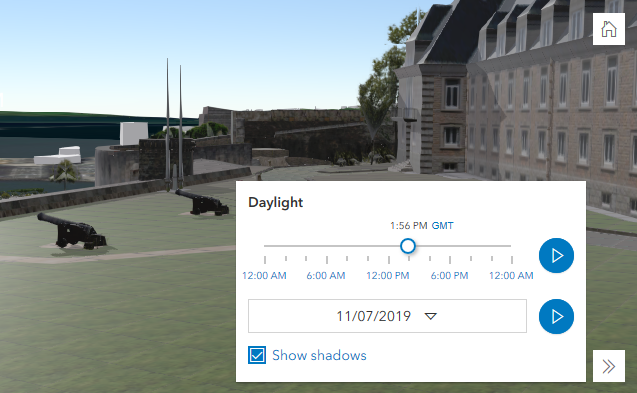
Daylight
require(["esri/widgets/Daylight"], function(Daylight) { /* code goes here */ });esri/widgets/DaylightThe daylight widget can be used to manipulate the time and date and to toggle shadows in a SceneView. When changing the time and date, the position of the sun and the stars gets updated accordingly, changing the lighting and the shadows in the scene. This widget modifies the date and directShadowsEnabled properties of SceneView.environment.lighting.
The daytime slider has an option to select the timezone. When the user changes the timezone, a new time in that timezone is calculated and displayed in the slider. The timezone selector can be disabled by setting timezone to false in the visibleElements property.
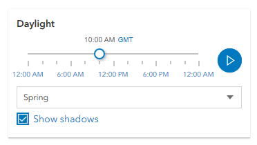
By default a calendar is displayed where the user can select the day, month and year. With the dateOrSeason property, the calendar can be replaced with a dropdown menu where a season can be selected:
const daylight = new Daylight({
  view: view,
  dateOrSeason: "season"
});
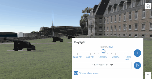
There are two play buttons, one corresponds to the daytime slider and it animates the time as it cycles through the minutes of the day. The second button corresponds to the date picker and it animates the time as it cycles through the months of the year. The speed of the animation can be set using the playSpeedMultiplier property.
const daylight = new Daylight({
  view: view,
  playSpeedMultiplier: 2
});
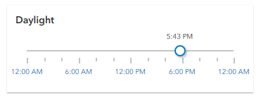
Except for the daytime slider, all the elements in the daylight widget can be hidden by using the visibleElements property:
const daylight = new Daylight({
  view: view,
  visibleElements: {
    timezone: false,
    datePicker: false,
    playButtons: false,
    shadowsToggle: false
  }
});
With these settings, the widget looks like this:
- See also:
// basic usage of the daylight widget using the default settings
const daylight = new Daylight({
  view: view
});
view.ui.add(daylight, "top-right");
Constructors
- new Daylight(properties)
- Parameter:properties Objectoptional
See the properties for a list of all the properties that may be passed into the constructor.
Example:// Typical usage const daylightWidget = new Daylight({ view: view }); view.ui.add(daylightWidget, "top-right");
Property Overview
| Name | Type | Summary | Class | |
|---|---|---|---|---|
| String|HTMLElement | The ID or node representing the DOM element containing the widget. more details | more details | Widget | |
| String | Controls whether the widget displays a date or a season picker. more details | more details | Daylight | |
| String | The name of the class. more details | more details | Accessor | |
| Boolean | When | more details | Widget | |
| String | The unique ID assigned to the widget when the widget is created. more details | more details | Widget | |
| String | The widget's label. more details | more details | Widget | |
| Number | Controls the speed of the daytime and date animation. more details | more details | Daylight | |
| SceneView | A reference to the SceneView. more details | more details | Daylight | |
| DaylightViewModel | The view model for the Daylight widget. more details | more details | Daylight | |
| Object | This property provides the ability to display or hide the individual elements of the widget. more details | more details | Daylight |
Property Details
The ID or node representing the DOM element containing the widget. This property can only be set once. The following examples are all valid use cases when working with widgets.
Examples:// Create the HTML div element programmatically at runtime and set to the widget's container const basemapGallery = new BasemapGallery({ view: view, container: document.createElement("div") }); // Add the widget to the top-right corner of the view view.ui.add(basemapGallery, { position: "top-right" });// Specify an already-defined HTML div element in the widget's container const basemapGallery = new BasemapGallery({ view: view, container: basemapGalleryDiv }); // Add the widget to the top-right corner of the view view.ui.add(basemapGallery, { position: "top-right" }); // HTML markup <body> <div id="viewDiv"></div> <div id="basemapGalleryDiv"></div> </body>// Specify the widget while adding to the view's UI const basemapGallery = new BasemapGallery({ view: view }); // Add the widget to the top-right corner of the view view.ui.add(basemapGallery, { position: "top-right" });
- dateOrSeason String
Controls whether the widget displays a date or a season picker. When the date picker is set, the user selects the date from a calendar. The season picker allows the user to choose a season from a drop-down list. Each season uses a fixed date corresponding to the Northern equinoxes and solstices.
Possible Values:"season"|"date"
- Default Value:"date"
Example:// set the season picker daylightWidget.dateOrSeason = "season";
The name of the class. The declared class name is formatted as
esri.folder.className.
When
true, this property indicates whether the widget has been destroyed.
The unique ID assigned to the widget when the widget is created. If not set by the developer, it will default to the container ID, or if that is not present then it will be automatically generated.
The widget's label.
This property is useful whenever the widget is controlled by another one (e.g. Expand)
- playSpeedMultiplier Number
Controls the speed of the daytime and date animation.
- Default Value:1.0
Example:// Plays the daylight animation at half of the default speed daylightWidget.playSpeedMultiplier = 0.5;
- viewModel DaylightViewModelautocast
The view model for the Daylight widget. This is a class that contains all the logic (properties and methods) that controls this widget's behavior. See the DaylightViewModel class.
This property provides the ability to display or hide the individual elements of the widget. Play buttons, shadow toggle button, date picker and timezone selector can be displayed or hidden by setting their corresponding properties to
trueorfalse. By default, all the elements are displayed.- Properties:
- optionalplayButtons BooleanDefault Value:true
When set to
false, neither of the play buttons are displayed.optionalshadowsToggle BooleanDefault Value:trueWhen set to
false, the shadow toggle button is not displayed.optionaldatePicker BooleanDefault Value:trueWhen set to
false, neither the date nor the season picker are displayed.optionaltimezone BooleanDefault Value:trueWhen set to
false, the timezone selector is not displayed.
Example:// display all elements, except the shadow toggle button daylightWidget.visibleElements.shadowsToggle = false; // disable all elements daylightWidget.visibleElements = { playButtons: false, shadowsToggle: false, datePicker: false, timezone: false };
Method Overview
| Name | Return Type | Summary | Class | |
|---|---|---|---|---|
| String | A utility method used for building the value for a widget's | more details | Widget | |
Destroys the widget instance. more details | more details | Widget | ||
| Boolean | Emits an event on the instance. more details | more details | Widget | |
| Boolean | Indicates whether there is an event listener on the instance that matches the provided event name. more details | more details | Widget | |
| Object | Registers an event handler on the instance. more details | more details | Widget | |
Widget teardown helper. more details | more details | Widget | ||
This method is primarily used by developers when implementing custom widgets. more details | more details | Widget | ||
| Object | This method is primarily used by developers when implementing custom widgets. more details | more details | Widget | |
Renders widget to the DOM immediately. more details | more details | Widget | ||
This method is primarily used by developers when implementing custom widgets. more details | more details | Widget |
Method Details
A utility method used for building the value for a widget's
classproperty. This aids in simplifying CSS class setup.Parameter:repeatable The class names.
Returns:Type Description String The computed class name. Example:// .tsx syntax showing how to set CSS classes while rendering the widget render() { const dynamicIconClasses = { [CSS.myIcon]: this.showIcon, [CSS.greyIcon]: !this.showIcon }; return ( <div class={classes(CSS.root, CSS.mixin, dynamicIconClasses)} /> ); }
- destroy()inherited
Destroys the widget instance.
Emits an event on the instance. This method should only be used when creating subclasses of this class.
Parameters:type StringThe name of the event.
event ObjectoptionalThe event payload.
Returns:Type Description Boolean trueif a listener was notified
Indicates whether there is an event listener on the instance that matches the provided event name.
Parameter:type StringThe name of the event.
Returns:Type Description Boolean Returns true if the class supports the input event.
Registers an event handler on the instance. Call this method to hook an event with a listener.
Parameters:A event type, or an array of event types, to listen for.
listener FunctionThe function to call when the event is fired.
Returns:Type Description Object Returns an event handler with a remove()method that can be called to stop listening for the event(s).Property Type Description remove Function When called, removes the listener from the event. Example:view.on("click", function(event){ // event is the event handle returned after the event fires. console.log(event.mapPoint); });
- own(handles)inherited
Widget teardown helper. Any handles added to it will be automatically removed when the widget is destroyed.
Parameter:handles WatchHandle|WatchHandle[]Handles marked for removal once the widget is destroyed.
- postInitialize()inherited
This method is primarily used by developers when implementing custom widgets. Executes after widget is ready for rendering.
This method is primarily used by developers when implementing custom widgets. It must be implemented by subclasses for rendering.
Returns:Type Description Object The rendered virtual node.
- renderNow()inherited
Renders widget to the DOM immediately.
- scheduleRender()inherited
This method is primarily used by developers when implementing custom widgets. Schedules widget rendering. This method is useful for changes affecting the UI.