ScaleRangeSlider
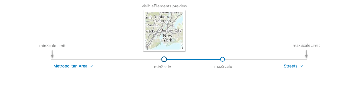
require(["esri/widgets/ScaleRangeSlider"], function(ScaleRangeSlider) { /* code goes here */ });esri/widgets/ScaleRangeSliderThe ScaleRangeSlider widget allows the user to set a minimum and maximum scale based on named scale ranges. When a layer is provided to the widget, the minScale and maxScale are set to the scale range of the layer.
The user can update the scale range by dragging thumbs across the slider to update the minScale and maxScale. The user can also change the minScale and maxScale by using the dropdowns underneath the minScaleLimit and maxScaleLimit. The thumbnail shows a preview of the scale based on the region specified.
- See also:
const scaleRangeSlider = new ScaleRangeSlider({
  view: view,
  layer: featureLayer,  // scale range of this layer sets initial minScale and maxScale
  region: "mx",  // preview thumbnail will be of Mexico
});
view.ui.add(scaleRangeSlider, "bottom-left");

// to update the layer min/max scale based on the slider
scaleRangeSlider.watch(["minScale", "maxScale"], function(value, oldValue, name) {
  featureLayer[name] = value;
});
Constructors
- new ScaleRangeSlider(properties)
- Parameter:properties Objectoptional
See the properties for a list of all the properties that may be passed into the constructor.
Property Overview
| Name | Type | Summary | Class | |
|---|---|---|---|---|
| String|HTMLElement | The ID or node representing the DOM element containing the widget. more details | more details | Widget | |
| String | The name of the class. more details | more details | Accessor | |
| Boolean | When | more details | Widget | |
| Boolean | When | more details | ScaleRangeSlider | |
| String | The unique ID assigned to the widget when the widget is created. more details | more details | Widget | |
| String | The widget's default label. more details | more details | ScaleRangeSlider | |
| Layer | When provided, the initial minScale and maxScale values will match the layer's. more details | more details | ScaleRangeSlider | |
| Number | The maximum scale of the active scale range. more details | more details | ScaleRangeSlider | |
| Number | The lowest possible maximum scale value on the slider. more details | more details | ScaleRangeSlider | |
| Number | The minimum scale of the active scale range. more details | more details | ScaleRangeSlider | |
| Number | The highest possible minimum scale value on the slider. more details | more details | ScaleRangeSlider | |
| SupportedRegion | The region that the scale thumbnails will focus on. more details | more details | ScaleRangeSlider | |
| MapView|SceneView | A reference to the MapView or SceneView. more details | more details | ScaleRangeSlider | |
| ScaleRangeSliderViewModel | The view model for this widget. more details | more details | ScaleRangeSlider | |
| VisibleElements | The visible elements that are displayed within the widget. more details | more details | ScaleRangeSlider |
Property Details
The ID or node representing the DOM element containing the widget. This property can only be set once. The following examples are all valid use cases when working with widgets.
Examples:// Create the HTML div element programmatically at runtime and set to the widget's container const basemapGallery = new BasemapGallery({ view: view, container: document.createElement("div") }); // Add the widget to the top-right corner of the view view.ui.add(basemapGallery, { position: "top-right" });// Specify an already-defined HTML div element in the widget's container const basemapGallery = new BasemapGallery({ view: view, container: basemapGalleryDiv }); // Add the widget to the top-right corner of the view view.ui.add(basemapGallery, { position: "top-right" }); // HTML markup <body> <div id="viewDiv"></div> <div id="basemapGalleryDiv"></div> </body>// Specify the widget while adding to the view's UI const basemapGallery = new BasemapGallery({ view: view }); // Add the widget to the top-right corner of the view view.ui.add(basemapGallery, { position: "top-right" });
The name of the class. The declared class name is formatted as
esri.folder.className.
When
true, this property indicates whether the widget has been destroyed.
- disabled Boolean
When
true, sets the widget to a disabled state so the user cannot interact with it.- Default Value:false
The unique ID assigned to the widget when the widget is created. If not set by the developer, it will default to the container ID, or if that is not present then it will be automatically generated.
- label String
The widget's default label.
- layer Layer
- maxScale Number
The maximum scale of the active scale range. When the maxScale reaches the maxScaleLimit, the maxScale value becomes 0 and there is no maximum scale set.
- maxScaleLimit Number
The lowest possible maximum scale value on the slider.
- minScale Number
The minimum scale of the active scale range. When the minScale reaches the minScaleLimit, the minScale value becomes 0 and there is no minimum scale.
- minScaleLimit Number
The highest possible minimum scale value on the slider.
- region SupportedRegion
The region that the scale thumbnails will focus on. Each region comes from the ISO 3166-1 alpha-2 code. See SupportedRegion for the list of regions that are currently supported.
- Default Value:"US"
- viewModel ScaleRangeSliderViewModelautocast
The view model for this widget. This is a class that contains all the logic (properties and methods) that controls this widget's behavior. See the ScaleRangeSliderViewModel class to access all properties and methods on the widget.
- visibleElements VisibleElementsautocast
The visible elements that are displayed within the widget. This property provides the ability to turn individual elements of the widget's display on/off.
Example:scaleRangeSlider.visibleElements = { preview: false // thumbnail preview of map will not be displayed }
Method Overview
| Name | Return Type | Summary | Class | |
|---|---|---|---|---|
| String | A utility method used for building the value for a widget's | more details | Widget | |
Destroys the widget instance. more details | more details | Widget | ||
| Boolean | Emits an event on the instance. more details | more details | Widget | |
| Boolean | Indicates whether there is an event listener on the instance that matches the provided event name. more details | more details | Widget | |
| Object | Registers an event handler on the instance. more details | more details | Widget | |
Widget teardown helper. more details | more details | Widget | ||
This method is primarily used by developers when implementing custom widgets. more details | more details | Widget | ||
| Object | This method is primarily used by developers when implementing custom widgets. more details | more details | Widget | |
Renders widget to the DOM immediately. more details | more details | Widget | ||
This method is primarily used by developers when implementing custom widgets. more details | more details | Widget |
Method Details
A utility method used for building the value for a widget's
classproperty. This aids in simplifying CSS class setup.Parameter:repeatable The class names.
Returns:Type Description String The computed class name. Example:// .tsx syntax showing how to set CSS classes while rendering the widget render() { const dynamicIconClasses = { [CSS.myIcon]: this.showIcon, [CSS.greyIcon]: !this.showIcon }; return ( <div class={classes(CSS.root, CSS.mixin, dynamicIconClasses)} /> ); }
- destroy()inherited
Destroys the widget instance.
Emits an event on the instance. This method should only be used when creating subclasses of this class.
Parameters:type StringThe name of the event.
event ObjectoptionalThe event payload.
Returns:Type Description Boolean trueif a listener was notified
Indicates whether there is an event listener on the instance that matches the provided event name.
Parameter:type StringThe name of the event.
Returns:Type Description Boolean Returns true if the class supports the input event.
Registers an event handler on the instance. Call this method to hook an event with a listener.
Parameters:A event type, or an array of event types, to listen for.
listener FunctionThe function to call when the event is fired.
Returns:Type Description Object Returns an event handler with a remove()method that can be called to stop listening for the event(s).Property Type Description remove Function When called, removes the listener from the event. Example:view.on("click", function(event){ // event is the event handle returned after the event fires. console.log(event.mapPoint); });
- own(handles)inherited
Widget teardown helper. Any handles added to it will be automatically removed when the widget is destroyed.
Parameter:handles WatchHandle|WatchHandle[]Handles marked for removal once the widget is destroyed.
- postInitialize()inherited
This method is primarily used by developers when implementing custom widgets. Executes after widget is ready for rendering.
This method is primarily used by developers when implementing custom widgets. It must be implemented by subclasses for rendering.
Returns:Type Description Object The rendered virtual node.
- renderNow()inherited
Renders widget to the DOM immediately.
- scheduleRender()inherited
This method is primarily used by developers when implementing custom widgets. Schedules widget rendering. This method is useful for changes affecting the UI.
Type Definitions
- SupportedRegion "AE"|"AR"|"AT"|"AU"|"BE"|"BG"|"BO"|"BR"|"CA"|"CH"|"CI"|"CL"|"CN"|"CO"|"CR"|"CZ"|"DE"|"DK"|"EE"|"EG"|"ES"|"FI"|"FR"|"GB"|"GL"|"GR"|"GT"|"HK"|"ID"|"IE"|"IL"|"IN"|"IQ"|"IS"|"IT"|"JP"|"KE"|"KR"|"KW"|"LI"|"LT"|"LU"|"LV"|"MA"|"MG"|"ML"|"MO"|"MX"|"MY"|"NI"|"NL"|"NO"|"NZ"|"PE"|"PL"|"PR"|"PT"|"RO"|"RU"|"RW"|"SE"|"SG"|"SK"|"SR"|"SV"|"TH"|"TN"|"TW"|"US"|"VE"|"VI"|"ZA"
The region that the scale thumbnails will focus on. Each region comes from the ISO 3166-1 alpha-2 code.
Code Region AEUnited Arab Emirates ARArgentina ATAustria AUAustralia BEBelgium BGBulgaria BOBolivia BRBrazil CACanada CHSwitzerland CICote D'Ivoire CLChile CNChina COColombia CRCosta Rica CZCzech Republic DEGermany DKDenmark EEEstonia EGEgypt ESSpain FIFinland FRFrance GBGreat Britain GLGreenland GRGreece GTGuatemala HKHong Kong IDIndonesia IEIreland ILIsrael INIndia IQIraq ISIceland ITItaly JPJapan KEKenya KRSouth Korea KWKuwait LILiechtenstein LTLithuania LULuxembourg LVLatvia MAMorocco MGMadagascar MLMali MOMacao MXMexico MYMalaysia NINicaragua NLNetherlands NONorway NZNew Zealand PEPeru PLPoland PRPuerto Rico PTPortugal RORomania RURussia RWRwanda SESweden SGSingapore SKSlovakia SRSuriname SVEl Salvador THThailand TNTunisia TWTaiwan USUnited States VEVenezuela VIU.S. Virgin Islands ZASouth Africa
- VisibleElements
The visible elements that are displayed within the widget. This provides the ability to turn individual elements of the widget's display on/off.
- Property:
- preview Boolean
Indicates whether the preview thumbnail of the region is visible. Default value is
true.